When activating the Zoom command for Data Analysis object, the "<<", "<", ">", ">>" buttons will deactivate. In order to reactivate them, you will have to re-select the time range you wish to display.
Movicon Help on Line - Rel. 11.7.1302
The Data Analysis is a more sophisticated version of the Trend object with which it shares some properties but offers some features of its own. The Data Analysis lets you analyse historical data by offering powerful data analyzer graphics. The Data Analysis's features are used differently compared to those used in normal Trends which have 2 ways of functioning: they can be used to display data at runtime and display historical data (run-pause). Instead, the Data Analysis offers more advanced features that allow you to carry out a more thorough analysis on historical data.
The Data Analysis object belongs to the Movicon "Trend-Charts-Data Analysis" category in the "Toolbox Window" and can be placed on screen by using the drag&drop techniques.
Data Analysis Functionality
The Data Analysis object has been designed to analyse historical data which can be viewed according to the time frame or range selected:
minute range
hour range
day range
month range
year range
When this page is loaded for the first time, the object will show the date/time range set in the "Date Range" priority. For example, if set with the hour range, it will load and display data of the current hour when opening. The database can be scrolled back and forth for each time range selected by using the "<<", "<", ">" and ">>" buttons. These buttons change roles according to the chosen context. For example, when selecting to view data for the current month, the "<<" and ">>" buttons will scroll back and forward one month at a time, and the "<" and ">" buttons will scroll back and ahead one day at a time.
Selecting a date range with the (min.), (hour), (day), (week), (month) and (year) buttons located on the object's left side will prompt a requery by the database according to the actual data being pointed to by the cursor positioned in the Data Analysis's Trend Area.
This is designed to make analysing data easier whenever needing to select specific times in the same data year range by simply pressing the desired button ('month', 'day', etc) in respect to the cursor's position on the data to be analysed instead of using the zoom.
|
|
When activating the Zoom command for Data Analysis object, the "<<", "<", ">", ">>" buttons will deactivate. In order to reactivate them, you will have to re-select the time range you wish to display. |
This Data Analysis provides four buttons on the first of the three button rows available for scrolling data from the database: "<<", "<", ">" and ">>". These buttons change how they work according to the time range selected and the unit of measure they will use to move back and forward will be shown in their text in brackets. For example, if you select the minute range, the text that will appear on the four buttons will be:
<<(min.)
<(sec.)
>(sec.)
>>(min.)
Therefore, if you click on the "<<(min.)" button, data from the minute prior to the current minute in time will be loaded.
These buttons can be set with a "Multiplier Factor" time scroll range. To enable the "Multiplier Factor", simply press one these buttons down for a few seconds. The text within the button will change by increasing or deceasing the numeric value representing the "Multiplier Factor". The incremental "Multiplier Factor" is stopped by releasing the button, for example "<<(2 min.)", "<(2 sec.)" text, etc. indicates a "Multiplier Factor" equal to 2. The "Multiplier Factor" value is increased by keeping the 'Next' data time range buttons (i.e. ">(sec.)" or ">>(min.)" pressed down, while the "back" data range buttons are kept pressed to decrease (i.e. "<<(min.)" or "<(sec.)" it.
When inserting a "Multiplier Factor", the time range to be loaded will be multiplied by that factor. For example, if selecting 1 minute as the time range and 5 as the "Multiplier Factor", the <<(5 min.)" button will not load data from the minute prior to the current time but data from 5 minutes prior to the current time.
Keep pressed either one of the two "<(sec.)" and ">(sec.)"buttons to increase or decrease by one unit at a time (increase/decrease by 1) and Keep pressed either one of the "<<(min.)" and ">>(min.)" buttons to increase or decrease minutes by 10 units at a time (increase/decrease by 10).
|
|
"Multiplier Factor" can be set a value range from 1 to 100. |
It is also possible to modify or read the "Multiplier Factor" value from Basic Script code using the "CurrentMultiplier" property from the "TrendCmdTarget" interface..
Moving the cursor around the chart
The Data Analysis object provides four buttons which you can use to move the cursor forwards and backwards while keeping the time range in view. When using these buttons, the cursor will move between two chart points (i.e. two values recorded on the database). These buttons are positioned above those used for selecting the time ranges and are:
|<<:First Point Button. Moves the cursor to the first point to the left of the chart for the selected time range.
<: Previous Point Button. Moves the cursor to the point (on the left) immediately before the one currently selected.
>: Next Point Button. Moves the cursor to the point (on the right) immediately after the one currently selected.
>>|: Last Point Button. Moves the cursor on to the last point to the Chart's right for the selected time range.
When the cursor is not displayed the scroll buttons are disabled. For example, this happens when a measure is activated (the "Measure" button).
|
|
When there are a great number of records display in the chart, it may not be possible to move from one point to another using the buttons in order to go from one record to the next consecutively due to the limit set in the display resolution. To make sure to scroll all the points currently viewed consecutively, you will need to enlarge the part of the curve desired or select the data tightly displayed together. |
The functions of the above indicated buttons can also be executed using certain keys from the keyboard:
"Home" Key: equivalent to the "|<<" button and moves the cursor to the first point on the left of the chart for the time range selected.
"Shift + left or down arrow" Keys: equivalent to the "<" button and moves the cursor onto the point immediately before (to the left) the one currently selected.
"Shift + right or up arrow" Keys: equivalent to the ">" button and moves the cursor onto the point immediately after (to the right) the one currently selected.
"End" Key: equivalent to the ">>|" button and moves the cursor to the last point to the right of the chart for the selected time range.
This object also allows you to perform comparisons on the historical data being analysed graphically. This is done by inserting a second curve for each pen using the last row of buttons on the right. The comparison curves will display the same time ranges (minute hour,etc.) by referring to the previous period selected by using the appropriate comparison buttons. For instance, if you select the minute time range for the period to be viewed (using the last row of buttons on the left), you will get the following results based on the comparison buttons selected on the right:
"(min)" Selection Button: the minute time range is selected for viewing. By using the scroll buttons you can then select the minute you want to view. For instance, if "31-01-2008 10:15" is the data and time selected, the time range displayed will be "10:15:00 - 10:15:59".
"None" Comparison Button: no comparison will be activated.
"(min.)" Comparison Button: the minute prior to the one selected will be displayed on the comparison curve, therefore the "31-01-2008 10:14" minute.
("hour") Comparison Button: the same minute selected but by referring to the previous hour which will be displayed on the comparison curve, therefore the "31-01-2008 09:15" minute.
"(day") Comparison Button: the same minute selected but by referring to the previous day which will be displayed on the comparison curve, therefore the "30-01-2008 10:15" minute.
("Week") Comparison Button: the same minute selected but by referring to the previous week which will be displayed on the comparison curve, therefore the "24-01-2008 10:15" minute.
("month") Comparison Button: the same minute selected but by referring to the previous month which will be displayed on the comparison curve, therefore the "31-12-2007 10:15" minute. When the day of the month selected is not in the previous month (ie. only a few months have a 31st day) the comparison curve will not display.
("year") Comparison Button: the same minute selected but referring to to the previous year which will be displayed on the comparison curve, therefore the "31-01-2007 10:15" minute.
At this point, any differences between the two curves will be indicated by colouring in the area in question between them. When positioning the mouse cursor on the point where the recording took place, two labels will appear reporting the two values and the date they were recorded. This will allow you to compare one time range with the same previous time range or with that of an hour, day or week ago etc. To activate the compare function, as already mentioned, simply click on one of the buttons in the "Compare Date Range Buttons" group.
The selected time range comparison should be consistent and if there is no data to compare, the curve will not appear. For instance, if you select the comparison curve to view data from a previous month that, however, has no data available, the comparison curve will not display.
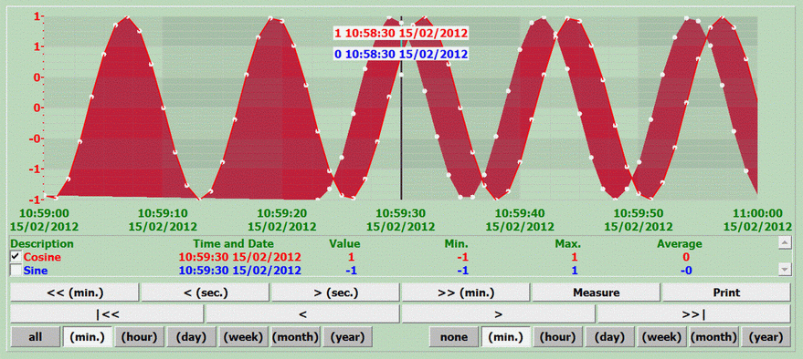
The above screenshot shows two curves, one displaying the selected minute range and the other is the comparison. The area between the two curves is colored in and when you position the cursor on a sampling point, a label will automatically show with the corresponding values, recording date and time for both curves. This type of comparison is simple and immediate.
By using the "Measure" command, you will be able to obtain the X and Y differences of two points of one curve or of different curves (see the "Measure Button" property).
Furthermore, the Data Analysis allows values that were recorded by the Data Logger and which have "good" qualities only to be displayed. To do this, you will need to activate a specific option in the Data Logger column's "Add Quality" property.
At runtime, you can select a custom time range to view that is different from those that can be selected by the relevant buttons. This gives you more flexibility in enabling you display data from time ranges that are more specific to your needs, for instance you may need to see data in ranges of 10 minutes, 1 day and 6 hours. To customize the time ranges, simply click on the "Time Area" within the Data Analysis to open the "Filter" window to set the time ranges you wish to view. The items available are:
From Date: represents the data extraction start date and time
To Date: represents the data extraction end date and time
From Date Compare: represents the data extraction date and time for the comparison curve
To Date Compare: represents the data extraction end date and time for the comparison curve
There is currently no control over the selection of time ranges to be viewed compared to the time ranges of the comparison curve. Therefore, make sure that you set the comparison curve time ranges to match those of the normal curve's time ranges to enable the filter to work correctly. This can be done by checking these conditions:
To Date - From Date = To Date Compare - From Date Compare